
User Manual
Bazefield Dashboard
TABLE OF CONTENTS
- 1 INTRODUCTION
- 2 PREREQUISITES
- 3 DASHBOARD TEMPLATES
- 4 LINKED DASHBOARDS
- 5 ADD TO MENU
- 6 WIDGETS
1 INTRODUCTION
Bazefield Dashboards is a framework for creating dashboards in the Bazefield Portal. The dashboard framework is used to create the monitoring dashboards. See example monitoring dashboard below.

2 PREREQUISITES
To be able to add and edit dashboard and linked dashboards, the user needs access to the Dashboard templates app and the Linked Dashboards app in the portal. The user also needs the EditDashboard privilege. This privilege can be added for a role or user on the Assigned Permissions tab in the Edit Role or Edit user view of the User Manager. For more info see the Bazefield Portal User Manual(BF-01-UM-001).
3 DASHBOARD TEMPLATES
Dashboard templates are templates for dashboards that can be placed in the menu with different parameters. Instances of the dashboard template display data based on the parameters set.
3.1 CREATE A DASHBOARD TEMPLATE
Creating dashboards is done in the Dashboard Templates app. The Dashboard Template app can be found in the portal under Administration > Configuration > Dashboard Templates. To create a new dashboard, press the “Add dashboard” button in the toolbar. The Add Dashboard Template dialog will then appear below.

3.2 LAYOUT STRUCTURE
The layout structure of dashboards is based on a 12-column grid. Each row can have a maximum of 12 columns. To create a dashboard with 3 rows like the screenshot below the following would be entered into the structure textbox 8-4,4-4-4,6-6. Columns are separated by hyphen and rows are separated by a comma.

3.3 ADDING WIDGETS
After the dashboard is created, it can be opened by clicking on the dashboard name in the dashboard list as seen below.

To add a widget, the dashboard needs to be in edit mode. To enable edit mode, click the Edit button in the top right corner of the dashboard. In edit mode the button Add widget is displayed. To add a widget, press this button and click on the widget you want to add in the Add widget dialog box that appears.

After adding a widget you can move it to the correct row and column with the move handle in the header of the widget.

To edit the settings of each widget, press the cogwheel in the header of the widget to get a dialog window with settings.
3.4 PARAMETERS IN WIDGET CONFIGURATION
Use the following syntax ${ParameterName} in the widget configuration to specify parameters. For example, set ${Site} in the widget configuration to specify Site as a parameter.

4 LINKED DASHBOARDS
Linked dashboards are used to link together dashboard templates so one can navigate between them via the navigation links in the toolbar of the linked dashboard and the content of the dashboard template is displayed
Creating linked dashboards is done in the Linked Dashboards app. The Linked Dashboards app can be found in the portal under Administration > Configuration > Linked Dashboards. To create a new linked dashboard, press the Add linked dashboard button in the toolbar. The Add Dashboard Template dialog will then appear below.

To add a dashboard template to the linked dashboard use the drop down and press the Add link button.
To change the order of the links use the up down arrows on the left of the links.
5 ADD TO MENU
To add a dashboard to the menu one first navigates to either the Dashboard template app or the Linked dashboard app in the portal. Then use the arrow in the menu to navigate to the folder where you want to add the dashboard and press the Add menu button for that dashboard.
5.1 MENU URL PARAMETERS
After a dashboard has been added to the menu, add the parameters used in the dashboard templates to the menu URL. See how to add parameters to the template in chapter Parameters in Widget configuration. This is done by pressing the Edit button on the bottom of the menu. After that press the edit icon on the dashboard to display the properties for this dashboard instance. See example for an instance of the Turbine dashboard below. The format is the same as the standard query string parameter format.

6 WIDGETS
This chapter will explain how to configure each of the different dashboard widgets.
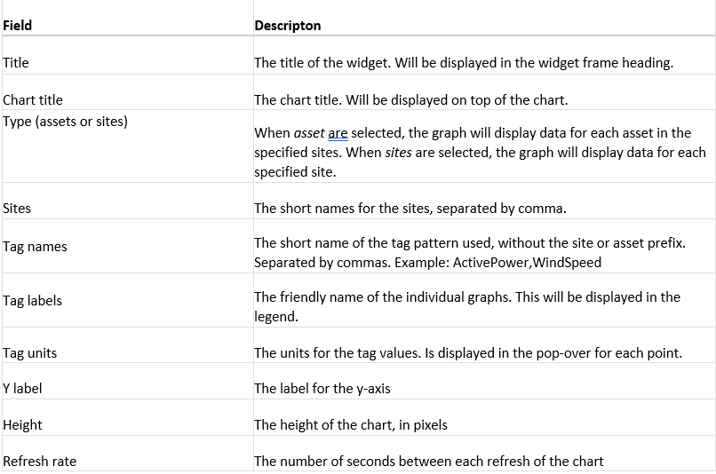
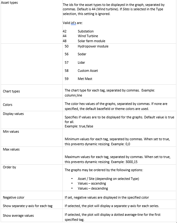
6.1 TIME SERIES CHART

6.1.1 CONFIGURATION
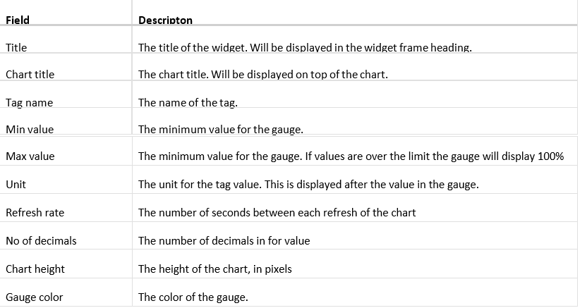
6.2 GAUGE
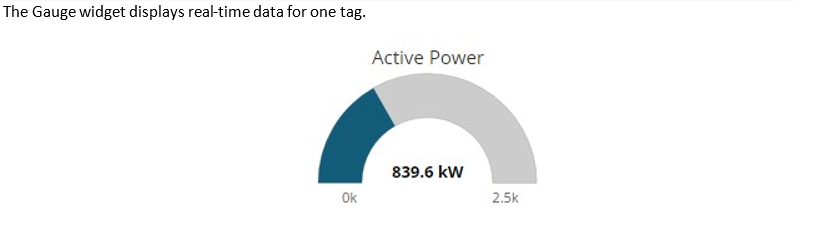
6.2.1 CONFIGURATION
6.3 SITE BAR CHART
The site bar chart displays real-time data for assets or sites.

6.3.1 CONFIGURATION
6.4 HTML COMPOSER
This widget can be used to display custom HTML that you want to display. Here you can use Bootstrap components and all other standard HTML elements.

The HTML is defined in the Template text box. See example code below.

6.5 PROCESS SCREEN
Process screen widget can display a process view in an IFRAME. Process screen name textbox is the name of the process screen. Height text box is the height of the IFRAME that displays the process screen. In the Query parameters textbox are the query parameters to send to the process screen.

6.6 REPORT
Report widget can display Excel (Classic) reports or HTML (New) reports. The Classic reports are located and managed in the Report Templates application and the HTML reports (new in Bazefield 7) are located and managed in the Report Management application. See separate documentation on how to configure reports.

Field | Descripton |
Title | The title of the widget. Will be displayed in the widget frame heading. |
Report Name | The name of the report. |
Height | Height of the IFRAME that displays the report (applies to Classic reports only) |
Query parameters | Query parameters to send to the report |
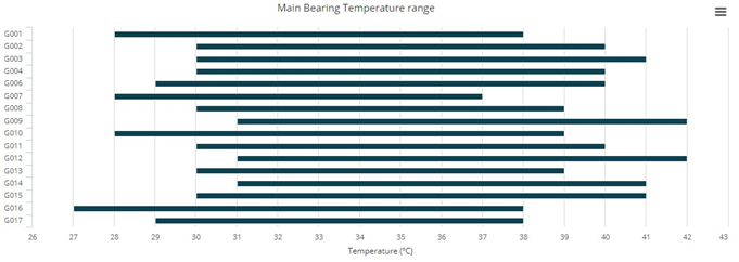
6.7 SITE COLUMN RANGE CHART
The site column range chart displays the variations of a specified tag measurement for all assets on a site.
6.7.1 CONFIGURATION
Field | Descripton | |
Title | The title of the widget. Will be displayed in the widget frame heading. | |
Chart title | The chart title. Will be displayed on top of the chart. | |
Site | The short-name for the site | |
Tag name | The short name of the tag, without site and asset prefix. Example: WindSpeed | |
From | The start time of the data interval. Abbreviations described in chapter 8.1.1 may be used. | |
To | The end time of the data interval. Abbreviations described in chapter 8.1.1 may be used. | |
Tag unit | The unit of the tag values. Example: m/s | |
Height | The height of the chart, in pixels. If not specified, the default height of 300 pixels are used. | |
Asset types | The ids for the asset types to be displayed in the graph, separated by commas. Default is 44 (Wind turbine).
Valid id’s are: | |
| 42 | Substation |
| 44 | Wind Turbine |
| 48 | Solar farm module |
| 50 | Hydropower module |
| 56 | Sodar |
| 57 | Lidar |
| 58 | Custom Asset |
| 59 | Met Mast |
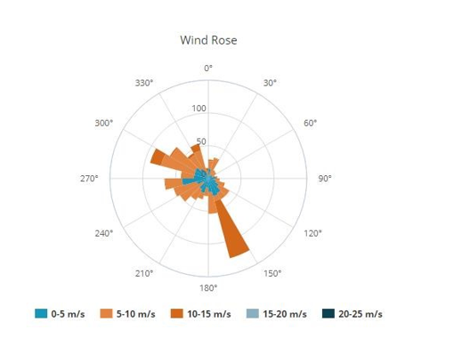
6.8 WIND ROSE
The wind rose widget typically displays the distribution of wind speed and direction.
6.8.1 CONFIGURATION
Field | Descripton |
Title | The title of the widget. Will be displayed in the widget frame heading. |
Chart title | The chart title. Will be displayed on top of the chart. |
X tag name | The tag name for the x-axis. Example: SITE-WTG001-WindDirection |
Y tag name | The tag name for the y-axis. Example: SITE-WTG001-WindSpeed |
From | The start time of the data interval. Abbreviations described in chapter 8.1.1 may be used. |
To | The end time of the data interval. Abbreviations described in chapter 8.1.1 may be used. |
Height | The height of the chart, in pixels. If not specified, the default height of 300 pixels are used. |
X interval | The interval in degrees Example: 15 |
Colors | Color of the graph, specified in hex codes, separated by commas. If none are specified, the default bazefield or theme colors are used. |
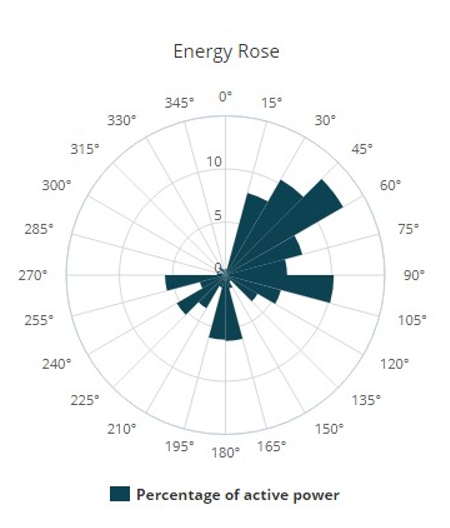
6.9 ENERGY ROSE
The energy rose widget typically displays the distribution of power produced by wind direction.
6.9.1 CONFIGURATION
Field | Description |
Title | The title of the widget. Will be displayed in the widget frame heading. |
Chart title | The chart title. Will be displayed on top of the chart. |
X tag name | The tag name for the x-axis. Example: SITE-WTG001-WindDirection |
Y tag name | The tag name for the y-axis. Example: SITE-WTG001-ActivePower |
From | The start time of the data interval. Abbreviations described in chapter 8.1.1 may be used. |
To | The end time of the data interval. Abbreviations described in chapter 8.1.1 may be used. |
Height | The height of the chart, in pixels. If not specified, the default height of 300 pixels are used. |
X interval | The interval in degrees Example: 15 |
Colors | Color of the graph, specified in hex codes, separated by commas. If none are specified, the default bazefield or theme colors are used. |
6.10 CUSTOM CHART
The Chart widget is a custom tool that enables creation of various charts. Both the parameters are in JSON format. Our charts use the HighCharts JavaScript component, and examples of various charts with configurations are found here: http://www.highcharts.com/demo
Note: Syntax errors in settings or configuration parameters will result in removal of the inputting settings once saved.
6.10.1 SETTINGS PARAMETER
The settings parameter contains the tags, aggregates, from, to, interval and title parameters.
Example:
  {
    "from": "*-1M",
    "to": "*",
    "tags": [
      {
        "aggregate": 1,
        "name": "TUR-WTG001-PI-ProducedMWh.AM.SUM"
      },
      {
        "aggregate": 1,
        "name": "TUR-WTG002-PI-ProducedMWh.AM.SUM"
      }
    ],
    "interval": "1d",
    "title": "Turbines",
    "showNow": "true"
  }
From and To
These may be specified as dates (ex 2017-01-01) or you could use the relative dates where * means now. Examples on relative dates are:
* | Now |
*-1d | The last day from now |
*-1m | The last minute from now |
*-1h | The last hour from now |
*-1w | The last week from now |
*-1M | The last month from now |
Interval
This is the sampling interval for the data, and is specified in milliseconds or with short codes as (10m, 1d, 1M etc)
Title
This is the chart title, and will be displayed on top of the chart, if specified. Specific Time Range
| From Field: | To Field: | Description: |
2018-01-23 | 2018-01-28 | Specific Data Range ( YYYY-MM-DD) |
Example:
  {
    "from": "2018-01-03",
    "to": "2018-01-023",
    "tags": [
The configuration parameter may include all other available options in Highcharts configurations, except the ones described in chapter 8.10.1. Please see the Highcharts option reference for more info at http://api.highcharts.com/highcharts
Example:
  {
    "options": {
      "chart": {
        "type": "line"
      },
      "tooltip": {
        "pointFormat": "{series.name}: <b>{point.y:.1f}</b><br/>",
        "shared": true
      }
    },
    "series": [
      {
        "name": "Turbine 01"
      },
      {
        "name": "Turbine 02"
      }
    ]
  }
6.11 XY PLOT
The XY plot displays scatter charts based on two tags for a selected interval.

6.11.1 CONFIGURATION
Field | Descripton | |
Title | The title of the widget. Will be displayed in the widget frame heading. | |
Chart title | The chart title. Will be displayed on top of the chart. | |
X tag name | The tag name for the x-axis. Example: SITE-WTG001-WindSpeed | |
X label | The axis label | |
X unit | The unit for the tag values. Is displayed in the pop-over for each point. | |
Y tag name | The tag name for the y-axis. Example: SITE-WTG001-ActivePower | |
Y label | The axis label | |
Y unit | The unit for the tag values. Is displayed in the pop-over for each point. | |
From | The start time of the data interval. Abbreviations described in chapter 8.1.1 may be used. | |
To | The end time of the data interval. Abbreviations described in chapter 8.1.1 may be used. | |
Height | The height of the chart, in pixels. If not specified, the default height of 300 pixels are used. | |
Colors | Color of the graph, specified in hex codes, separated by commas. If none are specified, the default bazefield or theme colors are used. | |
6.12 CUSTOM LOG
See custom log manual for details on how to add custom log widget.
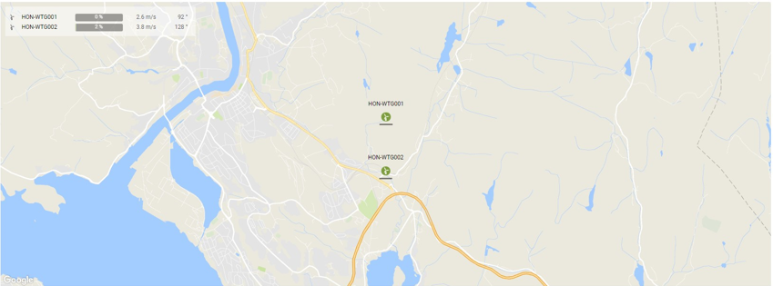
6.13 MAP
The Bazefield Map application provides real-time data from assets presented on the map to give an immediate overview of assets on sites.
6.13.1 CONFIGURATION
Field | Descripton |
Title | The title of the widget. Will be displayed in the widget frame heading. |
Site | The short name for the site |
Map type | Choose between Road, Terrain, Satellite and Hybrid map types. |
Map style | Choose between Normal, Baze, Night and Retro styles. |
Refresh interval | Interval in seconds, for KPI refresh |
Latitude | Latitude coordinate for center position (optional) |
Longitude | Longitude coordinate for center position (optional) |
Zoom level | Zoom level. Values from 4 to 16 (optional) |
Map height | The height of the map in pixels (optional) |
To | The end time of the data interval. Abbreviations described in chapter 8.1.1 may be used. |
Height | The height of the chart, in pixels. If not specified, the default height of 300 pixels are used. |
Marker graphics | If selected, choose between Field or Bar to visualize active power production. |
Table KPI visible | When checked, the a KPI overlay table will be shown in the top left corner of the map |
Marker title visible | When checked, the asset name will appear on top of each marker. |
Invert text color | When checked, the maker title color is inverted. |
Wind direction visible | When checked, an arrow on indicating the wind direction is displayed for the assets. |
Nacelle direction visible | When checked, an arrow indicating the nacelle direction is displayed for the assets. |
6.14 HEAT MAP
The heat map is graphical representation of tag data where the individual values contained in a matrix are represented with color-intensity.
6.14.1 CONFIGURATION
Field | Descripton | Required |
Title | The title of the widget. Will be displayed in the widget frame heading. |
|
Chart title | The chart title. Will be displayed on top of the chart. |
|
Assets | Asset short names, asset ids, or short names for sites, separated by comma | X |
Tag names | Comma-separated short-tag-names | X |
Friendly tag names | Comma-separated friendly names for the tags |
|
Min values | Minimum values for each tags, separated by comma. When min and max values are set, the heatmap will use percentage for coloring |
|
Max values | Maximum values for each tags, separated by comma. When min and max values are set, the heatmap will use percentage for coloring |
|
Show tag units | When checked, the heat map will display the tag units after the value in the map and pop-over |
|
Real-time data | When selected, the heat map will display latest value for the tags. |
|
Aggregated data | When selected, From, To and Aggregate fields need to be populated. Only one measurement per tag will be fetched. |
|
From | From date and time. (* means now, *-1M means 1 month back from now etc) |
|
To | To date and time. (* means now, *-1M means 1 month back from now etc) |
|
Aggregate | The aggregate to be calculated |
|
Height | The height of the chart, in pixels. Default is 300. |
|
Color | The maximum intensity color to be used, primary theme color will be used as default |
|
6.14.2 HTML
Directive that may be used in reports. See Configuration chapter for settings.
<baze-heatmap asset-ids="" tag-shortnames="" title="" height="" color="" decimals="" minvalues="" max-values="" friendly-names="" realtime="" from="" to="" aggregate="" showunits=""></baze-heatmap>
Note that when realtime is set to true, the from, to and aggregate properties are ignored.
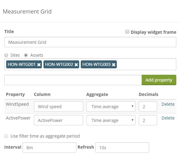
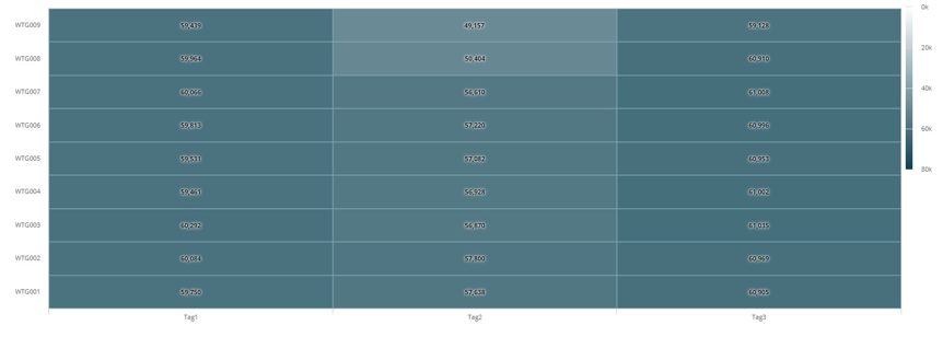
6.15 MEASUREMENT GRID
The measurement grid is a widget where one can setup a grid of measurements for assets or sites.
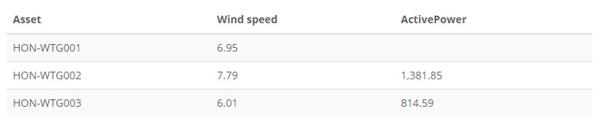
6.15.1 CONFIGURATION
In the configuration dialog setup either sites or assets and then fill in the property / tag suffix for the measurement to be shown in the grid. Select the aggregate to use for fetching data and the number of decimals to display per measurement n the property table. The Interval setting is how long the interval aggregates measurement data over and Refresh is how often data refreshes. The Measurement grid widget does not yet support using the filter to specify time.